

Coppock Curve with Nifty 50 and Gold Futures View
The Coppock Curve, a technical analysis indicator, is a monument to economist Edwin “Sedge” Coppock’s inventiveness. It was first created in 1962 to assist long-term investors in navigating the often-muddy waters of the stock market. Unlike fast-paced day trading strategies, the Coppock Curve looks for big movements in momentum over long periods, such as months or even years.
How is it calculated?
The Coppock Curve is a long-term, smoothed-out variation of the Rate of Change indicator. It requires two essential ingredients:
Momentum is defined as the percentage change in prices over a specified period. The Coppock Curve has two rates of change: a 14-month and an 11-month.
To prevent being thrown off by short-term volatility, these rates of change are averaged (Smoothing) over 10 months using a Weighted Moving Average (WMA).
This combination gives an unambiguous picture of the underlying momentum trend, assisting investors in differentiating between transient blips and actual market direction shifts.
Interpretation
The basic signal of the Coppock Curve is simple.
- Above zero: Positive momentum, possibly indicating a buying opportunity.
- Below zero: Indicates negative momentum, possibly indicating a sell signal.
However, keep in mind that the Coppock Curve is not a crystal ball. It’s a tool to be utilised with other types of analysis and basic study.
Considerations
- Timeframe: While the Coppock Curve was initially created for monthly charts, it may be converted to various periods, such as daily or weekly, by adjusting the parameters.
- Crossovers: While crossing the zero line is the major indication, some traders search for divergences between the Coppock Curve and actual price movement for further confirmation.
The Coppock Curve, like any other technical indicator, has limitations. It can occasionally provide misleading signals or overlook true trend shifts.
Real-time examples of Coppock Curve
Nifty 50
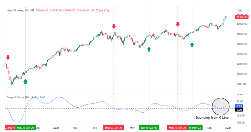
In the above chart of the Nifty 50, the Coppock curve is turning below the 0 line on March 2, 2020, suggesting a downtrend as the COVID pandemic started the fall. On June 22, 2020, the Coppock curve crossed the 0 line upward, signalling the recovery of the COVID-19 crash. The index may start a new bull run from here, and we witnessed a huge rally after that. Similarly, the Coppock curve generated reliable signals for markets to assess the direction of the Nifty 50 index. Currently, the Coppock curve is bouncing from the 0 line, suggesting that this bull run may continue and is not in the mood for correction this time.
Gold Futures
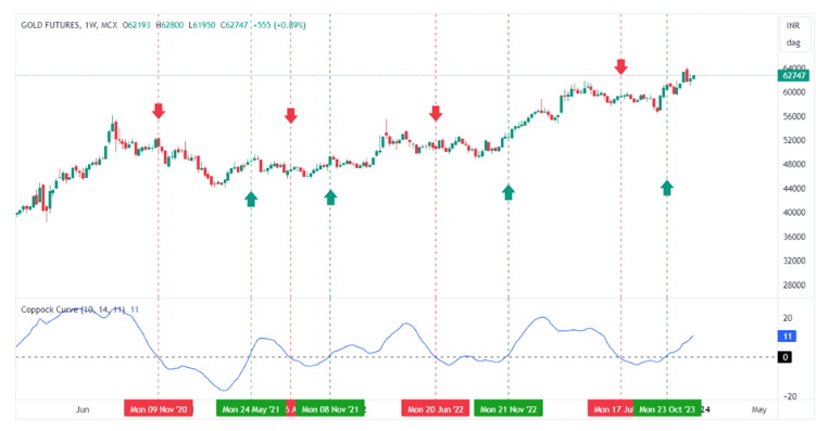
Looking at the gold chart with the Coppock curve, it is easy to predict the gold price surge and the consolidation, as recently, gold never crashed significantly and consolidated when signalled a downtrend by the Coppock curve. Looking at the past 4 years of data, the bullish signal created by the Coppock curve has capitalised on 12% of the highest returns each time. Currently, gold is again in bullish mode as the Coppock cure has crossed the 0 line. We can expect a 10% upward momentum again as it is already moving upwards.
The Coppock Curve offers a valuable tool for long-term investors seeking to identify potential turning points in the market. While not a one-size-fits-all solution, it can add clarity and confidence to your investment decisions when used thoughtfully and combined with other analysis methods.
Remember, successful investing requires a blend of technical analysis, fundamental research, and a healthy dose of common sense. The Coppock Curve can be a valuable addition to your toolbox, but it’s important to use it responsibly and in conjunction with other factors.